Tag Archives: Hue

Formal Assessment for Assessment II, 9x items, labeled 1 – 8a and 8b

For this assessment, taking on board my Tutor’s comments I took two new photos one for image to simply change the composition from portrait to landscape for consistency and I changed the last image for a strong picture.  I also reprinted all the images using my Tutor’s suggestion of adding a little lilac to the Hue as I was unhappy with the colour cast I appeared to be getting as I couldn’t get a perfect black or grey.  This intended Hue is very subtle and I like the result.

Included in the folder is my Tutor’s report Shaun Mullins – 512659 – Photography 1 Context & Narrative – Assignment 2  a printed copy of the anchoring text for each image  marked 8a the-unseen and my 300 word introduction marked 8b redundant-reflections and the photos.


Some additional remedial work to assignment 3

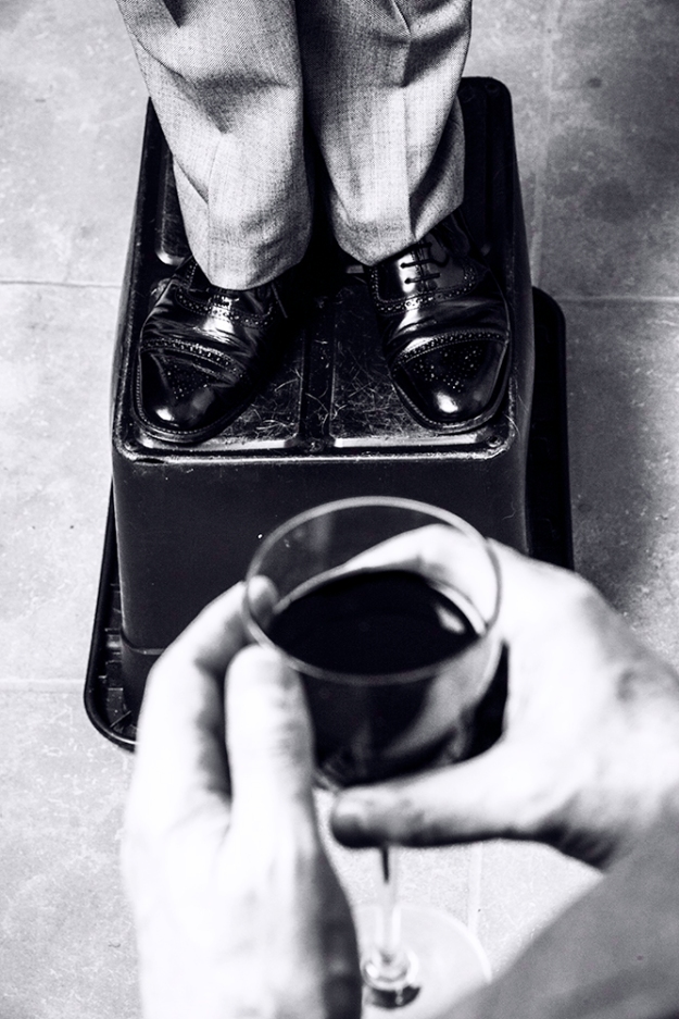
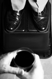
Further to my Tutor’s comments in his report for assignment 3, I decided to re-shoot image No.5, as my Tutor felt that the crop was too tight against the ‘soap-box’.

this is my new image.

_dsc2739-resized

D-800e, 24-120mm f/4 @ 92mm, 1/125 sec, f/13, ISO-125, flash used, daylight W.B. Adjustments in Lightroom, tint added in Photoshop, Hue 257, Saturation 3.  Camera mounted to tripod and tethered to lap-top.  A speedlight was mounted in a soft-box and remotely triggered using Pocket Wizard.

Here is a of my all my revised images.

This slideshow requires JavaScript.

Alternative images as per my Tutor’s comments.

This slideshow requires JavaScript.

This is my new alternative presentation from my original work for assignment 2 based upon my Tutors comments.

My Tutor commented on two images that he felt should have been composed in landscape to be consistent with my other images and he felt that the last image was weak in comparison the the rest.  I have therefor re-shot to offer better alternatives.

The first was referring to my dog and this was the original portrait version.

_DSC9096-resized

Resized-New_DSC2141

D-800e, 24-120mm f/4 @ 120mm, 1/20 sec, f/8, ISO-320, daylight W.B.  Adjustments made in Lightroom to convert to black-and-white and then image tinted in Photoshop, Hue 257, Saturation 3.

This new version composed in landscape photographed in RAW and converted to black-and-white in Lightroom and tinted in Photoshop.

This next image Clive felt was weak.

Resized-9589

Clive’s two objections were that again it has in portrait and he felt the colour was at odds with the black-and-white theme of the other images.

I  can not re-do this picture to landscape as time has moved on and this bud has since flowered and gone.  Furthermore, I was never one-hundred percent happy with it anyway, as I had struggled to come up with a better idea for an image.  However, I have recently had a new idea that I like….

alternative-idea

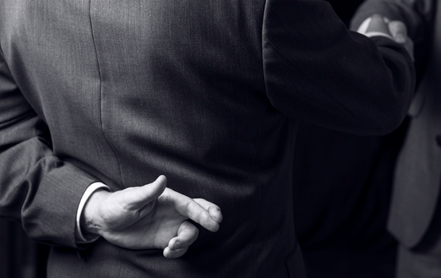
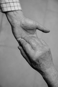
As you can see I have sketched out my idea of an image of myself suited and booted shaking hands with another suited and booted person whilst discreetly crossing my fingers.  I want this image to denote a business meeting or interview and connoting a message of hope and optimism for the future.  I set the camera up on a tripod, used one speedlight in a soft-box controlled remotely by Pocket wizards.  The camera was set to manual and manual focus and tethered to my lap-top for picture control, I also used a separate Sekonic lightmeter to meter the flash.

_dsc2804-resized

D-800e, 24-120mm f/4 @ 120mm, 1/125 sec, f/6.3, ISO-125, flash used, daylight WB.  Adjustments in Lightroom to black-and-white and colour tint adjustments made in Photoshop, Hue 257, Saturation 3.  On reflection of this picture, I now consider that a second light would have been in order, set in front of me and to the left to help separate my right arm from the background.  I could mess about in Photoshop to get better separation; but for this exercise I wont.

Using Clive’s suggested tinting I have produced new tinted versions of the rest of the black-and-white images.  The originals are on the left and the new tinted versions on the right.

_DSC9085-resized  Resized-New_DSC9085

_DSC9122-resized  Resized-New_DSC9122

_DSC9250-a-resized  Resized-New_DSC9250-a

_DSC9683-resized  Resized-New_DSC9683

_DSC9744-resized  Resized-New_DSC9744

Assignment 5 – Making it up

Club Class

from an original story by: Earl Hamner Jr.

club-class

A Traveller and his best friend were walking along a road they were both dead; and looking for somewhere to rest.

Eventually, they came to a high stone wall along one side of the road.  Set in to the wall was a tall arched open door.  Standing in the doorway was a smartly dressed, attractive, young lady.  The Traveller greeted her and asked her where they were.

“Why, this is Heaven!” She replied.

“Wow!” the man replied and they both proceeded to enter.

But the young lady stopped them and said, “I’m sorry, but we don’t accept pets.  There is a place for your dog just up the road, leave him with me and I will take care of him.”

The Traveller thought for a moment and unable to leave his friend outside he decided to continue his journey along the road.  Further along they came to a gate that stood alone, with neither a wall nor fence attached; and it looked as if it had never been closed, he saw a man behind the gate, leaning against a tree, reading a book.

“Excuse me!” called the Traveller. “Do you have any water?”

“Yes, there’s a pump over there, come on in.”

“How about my friend here?”  (Gesturing to his dog).

“You should find a bowl by the pump.”

They went through the gate, and sure enough, there was a hand pump with a bowl beside it. The traveller filled the water bowl for his friend before taking a long drink for himself.

When they were finished, the Traveller asked the ‘Gateman’,

“What do you call this place?”

“This is Heaven,” he answered.

“I’m confused,” Protested the Traveller. “The young lady down the road said that that was Heaven, too.”

Shaking his head sadly the ‘Gateman’ replied, “Oh no!  That’s certainly not Heaven! That’s the gate to hell!”

“But can you not do something to stop her tricking people in to entering hell?”  Demanded the Traveller.

“No!  We’re just happy that they screen out the folks who would leave their best friends behind.”  He replied with a wry smile.

no-dogs-1

So much for the contextual narrative!  What do we see?

A man stands in the foreground holding a dog on a lead, whilst gripping a walking stick with the other hand.  He’s looking at the dog that’s looking back, he’s dressed in a suit with a Yorkshire cap; both he and his dog are drained of any warm colours with a distinct cold blue hue tone as is most of the image.  In the background we see a sign indicating no dogs on a wall by an open door, inside the doorway we see a smartly dressed young woman, she appears to be pointing or wagging her finger, her mannerism implies a negative signal and her legs crossed emphasizes this negative message.   She appears to be illuminated by very warm amber light and a red halo rims around her head.

My intention for this image is to create a division between the outside world of the Traveller and his dog with the world beyond the door in which the women stands.  To achieve this I used the white balance settings of my camera, gelled speedlights and made additional enhancements in Lightroom.  The Traveller is between worlds, it is cold.  He and his dog are both dead and I wanted their shades to reflect this.  The young lady on the other hand is standing somewhere that is very warm and I wanted to convey this; I also wanted to hint at danger using rim lighting.

There is another message in this picture, one of temptation.  The young lady represents the fetish pleasures of capitalism; her sexuality is to tempt the man away from his moral values.  The price for this implied promise of luxury and pleasure is that he must be selfish and turn away from anything that could hold him back.  His dog represents his values and socialistic principles of loyalty, trust, responsibility and selflessness.

I didn’t want to create an obvious ‘Lucifer’ therefore I thought that a sharp dressed business woman would act as a suitably modern metaphor for him/her.

When creating this image, I tried to keep in mind Barthes idea of studium and punctum.  The Traveller and dog is part of the studium of the picture punctuated by the warm coloured image of the attractive women (the punctum).  I wanted to carefully construct a single image to project my intended narrative.

This was a particularly tricky picture to make when depending on the unreliability of a dog and using non-professional models.  Further complication was that my chosen doorway was unavailable to me due to a lost key.  The location I chose happened to be my local church which had the ideal doors.  I obtained permission from the Vicar however, on the appointed day the Vicar had taken his wife away for her Birthday and not informed anyone of our arrangement.  No one had the key to my chosen Choir Vestry door; so I had to use a fire escape door instead.  This side door was exposed to the wind and also needed to be wedged open and in the process of the shoot I dropped an expensive speedlight that bounced and although remained serviceable may now need to be serviced by Nikon.  I was unable to get the perfect shot as either the speedlights failed to fire at the perfect time or the dog kept moving around and directing my models is still a new experience.  I ended the afternoon feeling low as I thought that I had failed to get a suitable image.  I gave myself a couple of days space and looked again and I was pleased to find some images that I could collage together to make one suitable picture in Photoshop.

I enjoyed making this image and although it may not have a great wow factor, I am pleased that I was able to achieve my vision.  I would like to make more images based on a narrative theme in the future, perhaps using novels biblical stories, sagas, legends and songs.

Tutor’s feedback for Assignment 3

My Tutor’s feedback was very good!  He liked my work!

Shaun Mullins – 512659 – Photography 1 Context & Narrative – Assignment 3 (1)

I went on holiday and had to wait until my return before I knew what he thought of my work and if I had to re-do any of it.

I was happy to learn that my assignment had been successful with only advisories that he suggested that I could do to improve the pictures.

I had complained that I could not obtain a true black-and-white with my Canon printer and that Canon was unable to help as they will always use the colours in the mix even for grey-scale only images; so Clive my Tutor has suggested that I deliberately add a colour cast similar in practice to Ansel Adams.  Clive suggests using a slight blue purple hint to the images and advised that this could be achieved using the Black-and-White feature in the Layers and ticking tint and clicking on the tint box to bring up the colour menu.  Type 257 as the value for Hue and 3% for saturation.

He also suggested some adjustments in Levels to improve the images.

Image 1# for example, Clive suggests that I darken the bottom left corner in order to prevent drawing the eye towards it.

_DSC1462-Edit-resized-image-7


Resized-Levels-240_DSC1462-Edit

This is my new version which I hope is closer to Clive’s idea.

Img0112-resized

This again needed more work, Clive notice a dark line at the top right of the image that I had missed and I wasn’t happy with the cross that I wanted in the image, it was too faint.

Resized-Levels-Img0112

This is with the new adjustments made in Photoshop using the cloning tool and the dodge-and-burn tool.

This next image Clive suggested the shadow behind Sarah should be softened for better separation.

_DSC0792-Edit-resized

He is right of course and I think that this is a better version.

Resized-Levels_DSC0792-Edit

Image 4# was a little too dark.

_DSC1587-Resized-image-14

This is the new adjustment.

Resized-Levels_DSC1587

This was not my favourite image and I have struggled to improve it as Clive suggests.  I need more Photoshop experience.

Image 5# Clive complains that the composition is too tight with the edge of the box too close to the edge.

_DSC1478-Resized

Resized-Levels_DSC1478

Unfortunately I do not have anther photo that offers more space and this would require reshooting; so all I can do is add the tint.

Image 6# Clive complained was too dark.

_DSC1482-Resized

I hope that this is an improvement.

Resized-Levels_DSC1482

Adjustments made in Photoshop, Layers, Levels.

Image 7# This image Clive felt was okay.

_DSC0822-resized

Resized-Levels_DSC0822

I have just altered the tint.

Image 8# Clive suggested that the background was similar in tone to the hands.

_DSC0612-resized

This is my new version.

Resized-Levels_DSC0612

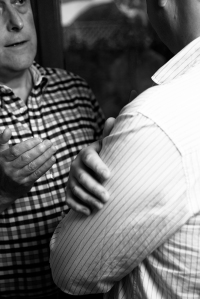
The last image that Clive critiqued was both for composition and exposure.  My hand should be more central and the focus of the picture and my shoulder is too bright, so drawing the eye away from the subject.

_DSC1508-Resized

My solution was to choose another image and make some adjustments in curves in Lightroom before finishing in Photoshop.

Resized_DSC1509-Edit

This I hope is better.