Tag Archives: composition

Formal Assessment for assessment III, 16x items, labeled 1 – 16

I have reprinted all my photos using the adopted lilac Hue style suggested by my Tutor as I like the result and further to his comments, I also re-took the photo of image 5 standing on the soap-box for a better composition and made some Photoshop improvements to some of the other images for example image 3 (please refer to my earlier blogs) .  Included in the folder is my Tutor’s report, Shaun Mullins – 512659 – Photography 1 Context & Narrative – Assignment 3 (1)  My 300 word introduction labeled 1 of 16 300-word-introduction The character descriptions from my friends and family and a printout of the associated anchoring text marked 6 of 16 a-self-portrait-as-regarded-by-othersDads Character StatementSarahs Character Statementimg547img551

Formal Assessment for Assessment II, 9x items, labeled 1 – 8a and 8b

For this assessment, taking on board my Tutor’s comments I took two new photos one for image to simply change the composition from portrait to landscape for consistency and I changed the last image for a strong picture.  I also reprinted all the images using my Tutor’s suggestion of adding a little lilac to the Hue as I was unhappy with the colour cast I appeared to be getting as I couldn’t get a perfect black or grey.  This intended Hue is very subtle and I like the result.

Included in the folder is my Tutor’s report Shaun Mullins – 512659 – Photography 1 Context & Narrative – Assignment 2  a printed copy of the anchoring text for each image  marked 8a the-unseen and my 300 word introduction marked 8b redundant-reflections and the photos.


Planning my assignment 5

requirements-listed-for-assignment-5

When researching for my last assignment I read ‘One Way Street’ a selection of essays by Walter Benjamin and I read an essay about Franz Kafka, an author I had not come across before and I made a mental note to lookout for his work.  My Tutor picked-up on my comments in my blog and recommended that I read some of his works a.  Therefore I decided to read his works looking for ideas for my next assignment.  To get myself started I made notes on the oxford dictionaries meaning for ‘context’ ‘narrative’ and the suggested rules.  As I read his works, I took notes in order to help me find some mental visions that might be turned in to physical pictures.  admittance-to-the-law

img571

img577

img569

img576

img575

img568

img567

img579


I have read through from cover to cover ‘The Essential Kafa’ and I have been inspired by a parable type story in the novel ‘The Trial’.   This short story is about a country gentleman who seeks access to the law, but the man is told by the doorman that he can not grant him access.  The country gentleman decides to wait until the doorman is given permission to grant him access, he waits all his life only to learn at the moment of death that the door was exclusively for him.  However, this story led me to another similar story that I thought might make a stronger narrative in one picture.

the-essential-kafka

A man and his dog  a-man-and-his-dog-were-walking-along-a-road

This story was used in a T.V. episode of ‘The Twilight Zone’, ‘The Hunt’,  first broadcast: January 26, 1962, Created by Rod Serling.  I am unable to find a reliable source that can confirm the original author of this story.  Some internet sources suggest that it is an old religious tale by an unknown however, Earl Hamner Jr.  an American television writer and producer is credited for the story of ‘The Hunt’ in The Twilight Zone therefore I assume that the story is his.  The gist of the story is that a man is on a road to Heaven and he is accompanied by his best friend which is his dog.  Along the way he comes to a gate with a man standing by it, the Traveller asks the man where they are and the ‘Gateman’ informs him he is at the gates of Heaven; but when the man tries to enter with his dog he is told that dogs are not allowed and the Traveller is forced to decide between entering the gates or staying with his best friend.

img580

img574

I believe that this story has a stronger narrative to produce as a single photo.  My idea is an image of the Traveller looking down at his dog as the Doorman or Gatekeeper tells him no dogs.  Also I can use this scene as a metaphor to modern society and how our capitalist life style sometimes tests our moral metal.  The Traveller is faced with a dilemma, should he be selfish and enter the gates alone for the imagined paradise beyond or stay outside keeping company with his best friend and putting his friend first.  I believe that we are currently living in a very selfish world and that this test is being applied in one way or another every day; so I think this story is very relevant to our current life-styles.

For the location, I think that my local Anglican Church is perfect.

My first thought were the gates to the church but this would present problems of traffic, pedestrians and a difficult background; so a doorway is a better choice and the arched style ideal for the implied idea of a Holly entrance.  Choosing a doorway eliminates the problems of traffic, pedestrians background and allows me to move my camera further away if required.  I shall mount the camera to a tripod for better composition control and if I need to resort to Photoshop i can easily merge more images together.

My ideal location is the Choir Vestry doorway, my wife sings in the choir and I have spoken to the Vicar who is happy to allow me to use it as my location.  I have a Labrador dog and a friend who has modeled for me before who can play the Traveller and a friend of my wife’s is happy to model as ‘Lucifer’.  My thoughts for the Devil is a very pretty smartly dressed young lady, to represent the metaphor for temptation.  She will be lit by a speedlight with an amber gel in a soft-box to give her warmth and another speedlight located directly behind her with a red gel in a large reflector dish to create a red rim-lighting / halo to suggest the source of the heat and a hint of danger.  The traveller and dog will be lit by either natural day light or another speedlite (un-gelled) for daylight white balance.  The camera will be set to tungsten or similar to trick the camera to create a cold look to the Traveller and dog.  The Traveller and dog are between worlds and this region of space I imagine to be cold. Hell on the other hand is hot and should reflect this by using the corrective gel to alter the white balance for my Devil.  By taking advantage of the white balance I can create a division between the worlds outside the door and that of inside and this warm contrast to the overall cold image will act as my punctum to the picture.

img566

img565

img573

img578

img562

img563

img564

As you can see, I made sketches and drew a couple of storyboards to help me with ideas.

Photography a Critical Introduction, Edited by Liz Wells

51bn-imbrel-_sx381_bo1204203200_

Photography a Critical Introduction, edited by Liz Wells, published by Routledge, Taylor & Francis Group.

The image on the front cover of this book was very appropriate for my experience when first reading this book: ‘Babel’ from Cockaign, by Gayle Chong Kwan.

The last listed book in my recommended reading list for the ‘Context and Narrative’ course to be read which completes my reading for both essential and recommended for the course. Phew!

I originally purchased and began reading this book for my ‘Art of Photography’ (AOP) course but I didn’t understand the relevance to my course and I also found it to be too heavy reading for me at that time and I only got half way through chapter one before putting it down.  I was keen to read books themed closer to the topics covered in the syllabus and additional technical books on composition, lighting, exposure, etc to bring me up to speed with my basic photography skills.  I felt that this book should have been listed in the essential reading list for my AOP course as none of the syllabus touched on critical theory and therefore wasn’t even appropriate for recommended reading.  However, this book was listed as recommended reading for this current coarse of Context and Narrative and in my opinion this should in fact be listed as essential reading.

This book is definitely worth reading once the critical theory of art in photography needs to be explored and understood.  There was much that linked to my current studying and I could see likely future links to my next courses, particularly chapter 4, ‘The subject as object: photography and the human body’ which discussed various forms of fetishism in art and explained what this word means in the art world.  Not just sex and deviant behavior but also desire and even a form of addiction which can be exploited by advertising, etc.

I still found it a heavy book and it took almost three weeks for me to read, but thanks to all the other reading that I have now done and the clear link it had to my current studying I was able to relate to the subject matter.  I am pleased that I have finally read this book and I realize that I made the right decision  two years ago to put the book down as I would not have understood a word and the messages that are now useful would have been missed.  I probably would not have thought to read it again; so missing a second chance to learn something from this book.

Working log for assignment 5, my initial thoughts.

9/9/16 – I am beginning my planning by going back to the start of this C&N course and re-reading the introduction and reviewing what I have learned in order to help me focus on what I need to achieve.

Up to now my assignments have been successful and my Tutor is very keen that I produce something that can top my achievements with this final assignment. So I want to produce something that is good and sophisticated enough to work well but at the same time try not to over complicate the work and try to keep the idea simple.  Well that’s the plan.  As I work out the project we will see if I can keep to this.

Keeping in mind my essay for my last assignment – I must be sure that every single element in my picture has a reason to be there and they must in some way contribute to the narrative.  The frame / choice of composition must suggest a greater context.  Lighting has also been mentioned and I am comfortable with using speedlights soft-boxes, flags etc.  I relish the opportunity to create a professional type set-up.  I thank my TAOP course and the section on lighting that I had spent extra time working on, I learned so much about both the basics and advanced photography skills on that course.

My plan is to produce one single photo; but it must suggest that it is part of a story.  All stories have a beginning, middle and end and my picture must suggest a previous moment that is leading to the next.  The picture must be readable and must have both a studium and punctum element on order for this image to really stand-out.  All the elements inside this picture must assist this process or they should not be there.  If I can meet these goals I am at least half-way there.

But the first half of the journey is to find the subject.  I intend to use my past brain-storming techniques and I have yet to do the last exercise of section five which is an interview and perhaps an idea may germinate from this.

Clive, my Tutor has recommended an author Kafka that I came across whilst reading Walter Benjamin and perhaps an idea may present itself from one of Kafka’s short-stories.

This last assignment is both exciting and a little scary; but life without a little fear is like a meal without a little herbs and seasoning, plain and dull.

Tutor’s feedback for Assignment 3

My Tutor’s feedback was very good!  He liked my work!

Shaun Mullins – 512659 – Photography 1 Context & Narrative – Assignment 3 (1)

I went on holiday and had to wait until my return before I knew what he thought of my work and if I had to re-do any of it.

I was happy to learn that my assignment had been successful with only advisories that he suggested that I could do to improve the pictures.

I had complained that I could not obtain a true black-and-white with my Canon printer and that Canon was unable to help as they will always use the colours in the mix even for grey-scale only images; so Clive my Tutor has suggested that I deliberately add a colour cast similar in practice to Ansel Adams.  Clive suggests using a slight blue purple hint to the images and advised that this could be achieved using the Black-and-White feature in the Layers and ticking tint and clicking on the tint box to bring up the colour menu.  Type 257 as the value for Hue and 3% for saturation.

He also suggested some adjustments in Levels to improve the images.

Image 1# for example, Clive suggests that I darken the bottom left corner in order to prevent drawing the eye towards it.

_DSC1462-Edit-resized-image-7


Resized-Levels-240_DSC1462-Edit

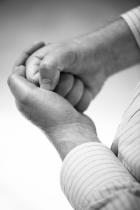
This is my new version which I hope is closer to Clive’s idea.

Img0112-resized

This again needed more work, Clive notice a dark line at the top right of the image that I had missed and I wasn’t happy with the cross that I wanted in the image, it was too faint.

Resized-Levels-Img0112

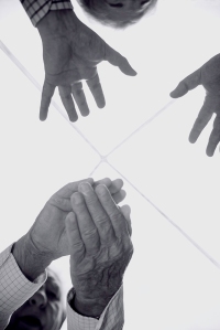
This is with the new adjustments made in Photoshop using the cloning tool and the dodge-and-burn tool.

This next image Clive suggested the shadow behind Sarah should be softened for better separation.

_DSC0792-Edit-resized

He is right of course and I think that this is a better version.

Resized-Levels_DSC0792-Edit

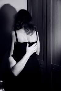
Image 4# was a little too dark.

_DSC1587-Resized-image-14

This is the new adjustment.

Resized-Levels_DSC1587

This was not my favourite image and I have struggled to improve it as Clive suggests.  I need more Photoshop experience.

Image 5# Clive complains that the composition is too tight with the edge of the box too close to the edge.

_DSC1478-Resized

Resized-Levels_DSC1478

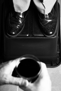
Unfortunately I do not have anther photo that offers more space and this would require reshooting; so all I can do is add the tint.

Image 6# Clive complained was too dark.

_DSC1482-Resized

I hope that this is an improvement.

Resized-Levels_DSC1482

Adjustments made in Photoshop, Layers, Levels.

Image 7# This image Clive felt was okay.

_DSC0822-resized

Resized-Levels_DSC0822

I have just altered the tint.

Image 8# Clive suggested that the background was similar in tone to the hands.

_DSC0612-resized

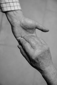
This is my new version.

Resized-Levels_DSC0612

The last image that Clive critiqued was both for composition and exposure.  My hand should be more central and the focus of the picture and my shoulder is too bright, so drawing the eye away from the subject.

_DSC1508-Resized

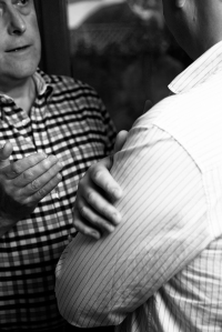
My solution was to choose another image and make some adjustments in curves in Lightroom before finishing in Photoshop.

Resized_DSC1509-Edit

This I hope is better.


Research Point – Gregory Crewdson

Fascinating documentary following the work of Gregory Crewdsen as he prepares and takes the photos of his cinematic scale images using cinematic-lights a film-crew of up to 60, professional actors, cranes, assistance from police and fire departments, closure of streets exactly as a scene from a movie would be organized, staged and shot only instead of a cinematic movie camera Crewdson uses a large-format still camera.  He will then take the best examples and merge them together in Photoshop collage them in to one final perfect image.

Do I think there is more to this work than aesthetic beauty?

yes, I find his images both beautiful and disturbing, as I believe, is his intention in order to create an interesting and engaging narrative.

Do I think Crewdson succeeds in making his work ‘psychological’?  What does this mean?

Yes, I do.  His pictures are almost dream like, the scenes are very surreal.  They encourage the audience to wonder what is happening? what has just happened? what is about to happen?  They are like that moment in a dream that is taking that turn in to the nightmare.  This touches on our own imagination, our own fears, our own anxieties.

What is your main goal when making pictures?  Do you think there’s anything wrong with making beauty your main goal?  Why or why not?

My main goal is to make interesting pictures, if the subject matter is beauty then that is what I want to create, if the subject matter is not then I want to make the image suitable for the subject with a choice of composition that holds the audience at least for a little while.  I do not think that there is anything wrong in making beautiful pictures; but it can become a little dull and boring if we can not vary the subject matter and produce images that offer some kind of narrative or symbiotic meaning that can engage, challenge and even entertain the audience in some way.

I like Crewdson’s pictures they may not be as subtle as Wall or DiCorcia but they are very well made and they can appeal to a public that doesn’t have to first have an acquired taste or understanding of art to appreciate the picture that they are viewing.


Exercise – Analysis of an advertisement image.

img522 - Copy

This is an advertisement that I scanned from Home and Antique magazine, published November 2015.  It is an advertisement for a wood-burning heater / stove which is at present a popular and trendy home accessory.  This image has been made in colour with what appears to be a warm colour temperature balance.

To the left we have our product the stove, in use, with a stack of neatly cut and arranged logs underneath providing an interesting design what otherwise would be an empty space under the stove and implies convenient and useful storage.  The stove’s chrome handle has been set at a slight angle; so as to be easily seen to imply ease of access  to the stove for adding additional fuel.  The stove stands against a grey wall that contrasts the warm orange and yellows of the flames with the cold but elegantly stylish grey coloured wall.

To the right of the stove we see a record-playing turntable on a small table that visually links the product with an idea of a modern fashion for the Retro and this message is re-enforced by the male subject who appears to be sitting on the floor with a pair of stereo headphones around his neck and a vinyl LP in his hands.  The vinyl record he holds is also a visual reference to the advertisement’s text referring to the ‘Crackle’ and Pop in the anchoring text along with the reference to ‘soundtrack’ and ‘sound from a real fire’.

The text helps to bring together all of these elements in to the audiences psyche.  The manufacturer appears to have carefully composed this image to suggest that their customers are connoisseurs of good taste and by owning their product they have added value and quality to their home and standard of living.  The use of the record player and LP helps to advertise a feature of their product that they believe to be a strength but can not easily be conveyed by either photo or text which is the gentle sound of the burning logs that would can enjoyed as background noise to a warm and cosy room.

This composition was created for the audience that would typically buy this magazine, an affluent middleclass customer who would have an interest in this type of product to complement their taste in antiques and the retro.  The advert also suggest a younger customer, perhaps one that will be spending their money on home improvements.

Exercise-Project-1-The Language of Photography

Photo by Elliott Erwitt, 1974.  Titled, ‘Dog legs’ This linked image is from: http://thephotographersgallery.org.uk

At first glance the joke in this picture can be easily missed, simply a small ‘cute’ dog on a lead with it’s owners in a park.  The image has been taken at a very low angle from the level of the small dog cutting off the rest of the owners bodies from the frame.  But a second look and something is wrong with the two pairs of legs.  The nearest (probably) the dog’s mistress in her high length boots and now we notice the second pair of legs belong to another dog that appears to be only standing on it’s hind legs like a man.  (In fact with very close scrutiny you can work out that these are a tall dog’s front legs and the dog is standing diagonally to the photographer with it’s belly and hind legs cropped from the frame.) The subjects are positioned approximately one-quarter of the way up the frame with the cute dog to the right looking in to the lens; so drawing the viewer’s eye away from the left side of the picture.  The small dog is what Roland Barthes would call the ‘punctum’ in the image. The mistress stands in the middle and our eyes naturally glance at the boots which we expect to see the second pair of legs take third place in our visual priority and so don’t stand out until we take a closer look at the picture.  The image is also in black-and-white this also helps with the deception.  If it had been in colour I am sure the tan fur legs would have appeared more obviously in the image and the joke would have been weaker.  Erwitt had used a structure of vertical lines in this image which has an element of design. The image is backlit which makes his subjects stand out from the background.  The composition draws the eyes from the bottom of the picture through these vertical lines to the top.  The placement of the tall dog’s legs next to the lady’s boots looks natural, as if two people were standing posing before the photographer with their dog.  The depth-of-field is kept fairly shallow to keep the eyes from looking deeper in to the background that is unimportant.

Camera Lucida by Roland Barthes

Camera_Lucida

Camera Lucida, by Roland Barthes, (2000) London, Vintage Classics, ISBN: 9-780099-225416.

Barthes examines, photography, what photography is, and how it works as a medium for art, commercial, social and private use.  This is an important book to read, unfortunately it can be a little hard to read, perhaps because of the translation and Barthes academic language; but worth persevering with.

  • Barthes classifies photos as either, ‘Empirical’, (Professional / Amateurs) ‘Rhetorical’ (Landscape / Objects / Portraits / Nudes) or ‘Aesthetic’, (Realism / Pictorialism).
  • A photograph is never anything but an antiphon (chant) of, “Look see,” “Here it is.”  It points a finger at the relationship it hold, it can not escape its denoted meaning. (page 5).
  • A photograph never distinguishes itself from its referent (what it represents).
  • A photo is a ‘signifier’
  • Barthes identifies two elements to a picture that is needed to make it interesting and he named them ‘Studium’ and ‘Punctum’.  Words he has taken from the Latin language.  ‘Studium’ is the general pleasing or good composition of the picture and Punctum is an element that punctuates through the image, an element that ‘pricks’ / creates an emotional response of some kind. (Page 25 – 28.)

The one thing that I got but didn’t fully realise until now is his idea of studium and punctum, a fellow student helped me with this when he posted a link to a good video explaining this theory.  https://phlearn.com/punctum-better-image