Tag Archives: Lightroom

The Adobe Lightroom CC / Lightroom 6

Lightroom

I have just read this book for a better understanding of Lightroom.  I first discovered Lightroom when I took up photography again and began to learn about the art of digital photography.  After a bit of research I purchased Adobe Photoshop Elements and got the basic principles of how it worked but I struggled to understand the connection of Adobe Bridge and I only understood that Adobe RAW was to be able to read my camera’s RAW files and nothing more.  I then came across Lightroom read the reviews and decided to try it.  It seemed to do all the things I needed and it didn’t need Adobe RAW however, I was a little confused as to why and Adobe had made it and where it sits in the workflow for a professional.  I found Lightroom easier to understand and use; so I have found it my best programs for photo editing.  Talking to other serious photographers, it appears that they all tend to use it more than Photoshop, which has been kept for just more extensive and complicated editing, as when required.  This book co-oberates this idea as the intention of Adobe to create a more user friendly photo editing package and also recognising that not all photos will want or need extensive editing and also the feather in the cap of this software is the batch editing capability for commercial photographers who will need to do basic adjustments to RAW images for straightforward output.

However, Photoshop is much more than just an editing suit it offers photo management tools that allows you to archive and retrieve your photos in lots of different ways; so you can cross file your images and retrieve them using all sorts of methods from date, location, camera, lens, or search words.  Lightroom is also compatible with Photoshop and an edited picture can be exported to Lightroom for further editing.  This is a very good book to read it is 700 pages of detailed information and I would highly recommend reading it and keeping it handy on your book shelf.


Some additional remedial work to assignment 3

Further to my Tutor’s comments in his report for assignment 3, I decided to re-shoot image No.5, as my Tutor felt that the crop was too tight against the ‘soap-box’.

this is my new image.

_dsc2739-resized

D-800e, 24-120mm f/4 @ 92mm, 1/125 sec, f/13, ISO-125, flash used, daylight W.B. Adjustments in Lightroom, tint added in Photoshop, Hue 257, Saturation 3.  Camera mounted to tripod and tethered to lap-top.  A speedlight was mounted in a soft-box and remotely triggered using Pocket Wizard.

Here is a of my all my revised images.

This slideshow requires JavaScript.

Alternative images as per my Tutor’s comments.

This slideshow requires JavaScript.

This is my new alternative presentation from my original work for assignment 2 based upon my Tutors comments.

My Tutor commented on two images that he felt should have been composed in landscape to be consistent with my other images and he felt that the last image was weak in comparison the the rest.  I have therefor re-shot to offer better alternatives.

The first was referring to my dog and this was the original portrait version.

_DSC9096-resized

Resized-New_DSC2141

D-800e, 24-120mm f/4 @ 120mm, 1/20 sec, f/8, ISO-320, daylight W.B.  Adjustments made in Lightroom to convert to black-and-white and then image tinted in Photoshop, Hue 257, Saturation 3.

This new version composed in landscape photographed in RAW and converted to black-and-white in Lightroom and tinted in Photoshop.

This next image Clive felt was weak.

Resized-9589

Clive’s two objections were that again it has in portrait and he felt the colour was at odds with the black-and-white theme of the other images.

I  can not re-do this picture to landscape as time has moved on and this bud has since flowered and gone.  Furthermore, I was never one-hundred percent happy with it anyway, as I had struggled to come up with a better idea for an image.  However, I have recently had a new idea that I like….

alternative-idea

As you can see I have sketched out my idea of an image of myself suited and booted shaking hands with another suited and booted person whilst discreetly crossing my fingers.  I want this image to denote a business meeting or interview and connoting a message of hope and optimism for the future.  I set the camera up on a tripod, used one speedlight in a soft-box controlled remotely by Pocket wizards.  The camera was set to manual and manual focus and tethered to my lap-top for picture control, I also used a separate Sekonic lightmeter to meter the flash.

_dsc2804-resized

D-800e, 24-120mm f/4 @ 120mm, 1/125 sec, f/6.3, ISO-125, flash used, daylight WB.  Adjustments in Lightroom to black-and-white and colour tint adjustments made in Photoshop, Hue 257, Saturation 3.  On reflection of this picture, I now consider that a second light would have been in order, set in front of me and to the left to help separate my right arm from the background.  I could mess about in Photoshop to get better separation; but for this exercise I wont.

Using Clive’s suggested tinting I have produced new tinted versions of the rest of the black-and-white images.  The originals are on the left and the new tinted versions on the right.

_DSC9085-resized  Resized-New_DSC9085

_DSC9122-resized  Resized-New_DSC9122

_DSC9250-a-resized  Resized-New_DSC9250-a

_DSC9683-resized  Resized-New_DSC9683

_DSC9744-resized  Resized-New_DSC9744

Assignment 5 – Making it up

Club Class

from an original story by: Earl Hamner Jr.

club-class

A Traveller and his best friend were walking along a road they were both dead; and looking for somewhere to rest.

Eventually, they came to a high stone wall along one side of the road.  Set in to the wall was a tall arched open door.  Standing in the doorway was a smartly dressed, attractive, young lady.  The Traveller greeted her and asked her where they were.

“Why, this is Heaven!” She replied.

“Wow!” the man replied and they both proceeded to enter.

But the young lady stopped them and said, “I’m sorry, but we don’t accept pets.  There is a place for your dog just up the road, leave him with me and I will take care of him.”

The Traveller thought for a moment and unable to leave his friend outside he decided to continue his journey along the road.  Further along they came to a gate that stood alone, with neither a wall nor fence attached; and it looked as if it had never been closed, he saw a man behind the gate, leaning against a tree, reading a book.

“Excuse me!” called the Traveller. “Do you have any water?”

“Yes, there’s a pump over there, come on in.”

“How about my friend here?”  (Gesturing to his dog).

“You should find a bowl by the pump.”

They went through the gate, and sure enough, there was a hand pump with a bowl beside it. The traveller filled the water bowl for his friend before taking a long drink for himself.

When they were finished, the Traveller asked the ‘Gateman’,

“What do you call this place?”

“This is Heaven,” he answered.

“I’m confused,” Protested the Traveller. “The young lady down the road said that that was Heaven, too.”

Shaking his head sadly the ‘Gateman’ replied, “Oh no!  That’s certainly not Heaven! That’s the gate to hell!”

“But can you not do something to stop her tricking people in to entering hell?”  Demanded the Traveller.

“No!  We’re just happy that they screen out the folks who would leave their best friends behind.”  He replied with a wry smile.

no-dogs-1

So much for the contextual narrative!  What do we see?

A man stands in the foreground holding a dog on a lead, whilst gripping a walking stick with the other hand.  He’s looking at the dog that’s looking back, he’s dressed in a suit with a Yorkshire cap; both he and his dog are drained of any warm colours with a distinct cold blue hue tone as is most of the image.  In the background we see a sign indicating no dogs on a wall by an open door, inside the doorway we see a smartly dressed young woman, she appears to be pointing or wagging her finger, her mannerism implies a negative signal and her legs crossed emphasizes this negative message.   She appears to be illuminated by very warm amber light and a red halo rims around her head.

My intention for this image is to create a division between the outside world of the Traveller and his dog with the world beyond the door in which the women stands.  To achieve this I used the white balance settings of my camera, gelled speedlights and made additional enhancements in Lightroom.  The Traveller is between worlds, it is cold.  He and his dog are both dead and I wanted their shades to reflect this.  The young lady on the other hand is standing somewhere that is very warm and I wanted to convey this; I also wanted to hint at danger using rim lighting.

There is another message in this picture, one of temptation.  The young lady represents the fetish pleasures of capitalism; her sexuality is to tempt the man away from his moral values.  The price for this implied promise of luxury and pleasure is that he must be selfish and turn away from anything that could hold him back.  His dog represents his values and socialistic principles of loyalty, trust, responsibility and selflessness.

I didn’t want to create an obvious ‘Lucifer’ therefore I thought that a sharp dressed business woman would act as a suitably modern metaphor for him/her.

When creating this image, I tried to keep in mind Barthes idea of studium and punctum.  The Traveller and dog is part of the studium of the picture punctuated by the warm coloured image of the attractive women (the punctum).  I wanted to carefully construct a single image to project my intended narrative.

This was a particularly tricky picture to make when depending on the unreliability of a dog and using non-professional models.  Further complication was that my chosen doorway was unavailable to me due to a lost key.  The location I chose happened to be my local church which had the ideal doors.  I obtained permission from the Vicar however, on the appointed day the Vicar had taken his wife away for her Birthday and not informed anyone of our arrangement.  No one had the key to my chosen Choir Vestry door; so I had to use a fire escape door instead.  This side door was exposed to the wind and also needed to be wedged open and in the process of the shoot I dropped an expensive speedlight that bounced and although remained serviceable may now need to be serviced by Nikon.  I was unable to get the perfect shot as either the speedlights failed to fire at the perfect time or the dog kept moving around and directing my models is still a new experience.  I ended the afternoon feeling low as I thought that I had failed to get a suitable image.  I gave myself a couple of days space and looked again and I was pleased to find some images that I could collage together to make one suitable picture in Photoshop.

I enjoyed making this image and although it may not have a great wow factor, I am pleased that I was able to achieve my vision.  I would like to make more images based on a narrative theme in the future, perhaps using novels biblical stories, sagas, legends and songs.

Creating Assignment 5

I arranged with our Vicar to take the photos on Sunday, October 17, which was also a convenient day for my two models.  After the last service the church would be free and I would not be in anyone’s way or be interfering with church services.  I made sure all batteries were fully charged, and I made up the light-boxes in preparation for a quick set-up.  I always take photos in RAW and having experimented at home with both lighting and white balance I decided to manually set the white balance on my camera to the lowest colour temperature for maximum effect (2500K).

The equipment for the shoot consisted of:  Nikon D800e, 24-120mm f/4 zoom lens, Tripod, Sekonda lightmeter, Pocket Wizard TT1 and AC3 controller mounted to the camera, 3 x Nikon speedlights controlled by 3 x TT5 Pocket Wizards, 1 x amber gel, 1 x red gel, 1 x dish reflector, 1 x 120 x 40 long rectangular soft-box, 1 x large square soft-box, 3 light stands with tilting brackets, 1 x large black flag / reflector.

Props:  ‘No Pets’ sign (sticker mounted on a white board and stuck to the wall by the door using double sided sticky pads.  My pet dog Honey on her lead, walking stick to imply their journey.

Costume: Business suit for Ann-Marie, County suit for Graham.

The lights were configured as follows:

In side the church I set up a speedlight with a TT5, gelled red and a reflector dish attached then mounted this assembly to light stand and positioned behind my female model (Ann-Marie) at head height in order to create the red rim-lighting.  I then used a speedlight with a TT5 and an amber gel with the 120 x 40 soft-box to illuminate the whole body length of Ann-Marie.

As the weather was overcast, I needed to use the large soft-box un-gelled to illuminate my second model (Graham) with my dog (Honey).  This was fitted to a light stand and stood to the left of the camera above the height of Graham and angled down.

prep

This test shot illustrated my lighting and you can just see the edge of the rectangular soft-box top right corner of the door above and behind Ann-Marie.

However, the shoot didn’t start as planned.  The Vicar was not around as I later discovered that he had gone away with his wife as it was her Birthday and he hadn’t mentioned my photo shoot to anyone.  I was able to arrange for a volunteer to return to the church after lunch to open it up for me for my photography; but the next problem was when I returned at the appointed time and the church was opened for me we could not find a key to the Choir Vestry (the door I had chosen for the shoot) so I had to use an alternative door that was accessible which was a fire-door on the side of the church.  This presented two new problems firstly I was exposed to the wind which was a little gusty and behind this door which was close to the alter an large stage was set up for the 11am services with musical instruments.  The door wouldn’t stay open and we had to find something to wedge it open that I later had to remove in Photoshop.  The door itself was a fire-door and again these handles would have to be erased and the background behind Ann-Marie would also need altering in Photoshop.

On setting up the lighting I managed to drop an expensive Nikon speedlight on to the stone floor, luckily it still worked but something appears to be loose inside; so I will no doubt have to send it off to Nikon for servicing.  My wife had to hold the large soft-box to stop it from being blown over and Honey was naturally restless.  The other problem was that the speedlights needed lite to recycle; so didn’t always fire with each shot taken.  This is where more expensive studio lights prove superior but at this moment in time I can not justify the investment.

I directed Ann-Marie to stand just inside the church door with the rectangular soft-box directly opposite her and the red gelled light hidden behind her head and holding up her hand to indicate the signal to stop and then to waggle her finger to convey the same message.  I also directed Graham to for two types of pose the first look thoughtfully at the dog and the second to be looking towards Ann-Marie for comparison.  I had to make various adjustments to positioning of the two soft-boxes and power output which eat into the time. We were only able to work for two hours before the weather threatened rain and we had to stop and I was feeling a little frustrated and low as I felt that I hadn’t been able to find the picture.

On returning home I transferred the photos to my computer but then left it for a couple of days before properly looking through them in Lightroom.  When I returned to my work I found that I had taken 290 photos and after spending some time comparing the images I was able to select a six images that I felt that I could merge together to make one suitable picture.

I then selected which images would be suitable for Graham and Honey and which would be suitable for Ann-Marie, I then made the appropriate adjustments in Lightroom to enhance the cold or warmth make any-other fine adjustments before exporting to Photoshop.  In Photoshop I then had to remove the unwanted artifacts from the pictures such as the item used to wedge the door open the fire-door handles and the staging behind Ann-Marie.  When the images were sufficiently ‘cleaned-up’ I merged the two to create my final picture.  As it happened only one image of Graham with only one image of Ann-Marie worked as suitable matches, due to the positioning of Graham and where Ann-Marie was looking; but I had what I was originally looking for which was a moment of decision from the Traveller as the doorman is advising him that he must enter alone.  I was pleased that this image also provided a great expression from Honey as she looks back at Graham.

 24-120mm f/4 @ 38mm, 1/125, f/5, ISO 125, WB 2500K.  Adjusted in Lightroom.

24-120mm f/4 @ 38mm, 1/125, f/5, ISO 125, WB 2500K.  Adjusted in Lightroom.

From these six images only two worked together.

graham-and-honey

ann-marie-1


Tutor’s feedback for Assignment 3

My Tutor’s feedback was very good!  He liked my work!

Shaun Mullins – 512659 – Photography 1 Context & Narrative – Assignment 3 (1)

I went on holiday and had to wait until my return before I knew what he thought of my work and if I had to re-do any of it.

I was happy to learn that my assignment had been successful with only advisories that he suggested that I could do to improve the pictures.

I had complained that I could not obtain a true black-and-white with my Canon printer and that Canon was unable to help as they will always use the colours in the mix even for grey-scale only images; so Clive my Tutor has suggested that I deliberately add a colour cast similar in practice to Ansel Adams.  Clive suggests using a slight blue purple hint to the images and advised that this could be achieved using the Black-and-White feature in the Layers and ticking tint and clicking on the tint box to bring up the colour menu.  Type 257 as the value for Hue and 3% for saturation.

He also suggested some adjustments in Levels to improve the images.

Image 1# for example, Clive suggests that I darken the bottom left corner in order to prevent drawing the eye towards it.

_DSC1462-Edit-resized-image-7


Resized-Levels-240_DSC1462-Edit

This is my new version which I hope is closer to Clive’s idea.

Img0112-resized

This again needed more work, Clive notice a dark line at the top right of the image that I had missed and I wasn’t happy with the cross that I wanted in the image, it was too faint.

Resized-Levels-Img0112

This is with the new adjustments made in Photoshop using the cloning tool and the dodge-and-burn tool.

This next image Clive suggested the shadow behind Sarah should be softened for better separation.

_DSC0792-Edit-resized

He is right of course and I think that this is a better version.

Resized-Levels_DSC0792-Edit

Image 4# was a little too dark.

_DSC1587-Resized-image-14

This is the new adjustment.

Resized-Levels_DSC1587

This was not my favourite image and I have struggled to improve it as Clive suggests.  I need more Photoshop experience.

Image 5# Clive complains that the composition is too tight with the edge of the box too close to the edge.

_DSC1478-Resized

Resized-Levels_DSC1478

Unfortunately I do not have anther photo that offers more space and this would require reshooting; so all I can do is add the tint.

Image 6# Clive complained was too dark.

_DSC1482-Resized

I hope that this is an improvement.

Resized-Levels_DSC1482

Adjustments made in Photoshop, Layers, Levels.

Image 7# This image Clive felt was okay.

_DSC0822-resized

Resized-Levels_DSC0822

I have just altered the tint.

Image 8# Clive suggested that the background was similar in tone to the hands.

_DSC0612-resized

This is my new version.

Resized-Levels_DSC0612

The last image that Clive critiqued was both for composition and exposure.  My hand should be more central and the focus of the picture and my shoulder is too bright, so drawing the eye away from the subject.

_DSC1508-Resized

My solution was to choose another image and make some adjustments in curves in Lightroom before finishing in Photoshop.

Resized_DSC1509-Edit

This I hope is better.


Exercise-Project-2-Masquerades-Childhood memories

In this exercise I have created an image to represent a childhood memory.  I have based the idea of this project on Roland Barthes theory of mythology.  It struck me that our memories are a form of myth.  Our memories are never quite as they really were.  We recall through rose-tinted-glasses, our childish imaginings were myths both good and bad. My memory is of being scared of the dark as a child, particularly after having watched a scary episode of Dr. Who.  I was most scared of the Cyber-men and I recall dreaming of being chased and caught by the Cyber-men, I would hide under the bedclothes and peek out and being afraid of the shadows.  The myths of the Bogieman, monsters, ghosts and goblins haunted my dreams and imaginings to such an extent that as a very young child I could not go to sleep unless a light was left on in my room.

Resized-0391

D-800e, 24-120 f/4 @24mm, 1/125, f/11, ISO-6400, WB-Auto.  One remote speedlight operated via Pocket Wizard, converted to grey-scale in Lightroom and cropped.

I planned this idea out first on paper, putting my thoughts down which helped me quickly find an idea.  My thoughts initially were the usual happy memories of sunshine and ice-cream; but as I considered the theme of myth and I considered the darker side of childhood fancies.  The final product was converted to black-and-white as I felt that this made the image more dark and sinister, I also was not concerned about high ISO for this image because the grainier the image appears the better to imply a memory.

The Mystery of P.I.Y. (Printing It Yourself)

I have just purchased and successfully setup a printer for producing quality photographs.  To be honest I have been postponing this day simply due to my frustrating experience with I.T.  I began life with photography in the darkroom; so I am comfortable with the wet developing process but software and hardware compatibility leaves me cold through a working life of bitter experiences!  The prospect of having to struggle with printers, software and computers has not been a happy one for me in the past.  However, I have bitten the bullet and within a day I was successfully printing photos to send to my Tutor for assessment.

The tipping point in the decision to take the plunge was as a result of unsuccessfully getting my assignment two photos printed satisfactorily from a third-party.  On checking with my Tutor he was insistent that my prints should be consistent and of high quality.  I consulted my student forum for advice and one of my fellow students recommended the Canon PI7250 which is available for around £50.  At first I was annoyed with my Tutor; but on reflection realized he was right and I was being silly.  So I purchased a printer from Amazon on next working day delivery and had it running by late evening on the same day of delivery.  I am using a colour Spyder4 to calibrate my screen and I downloaded an up to date printer driver in order to be able to create a reliable printer profile for Lightroom and Photoshop.

I have set Photoshop and Lightroom for 300PPI and made sure the printer is set to high quality on slow output setting.

Working log for Assignment II – The Unseen

_DSC9683-resized

For my second assignment, I have been given a choice between photographing the unseen or using props to create a narrative.  This is my learning log.

For this project I have decided to choose the first option, the unseen.  My reason, is that I feel that this is more challenging and it can help me become more familiar with the theory of semiotics and how to put it into practice in my future compositions.  The Unseen is another form of pictorial narrative; but this time I am going about it in another way.

Part of my brief is to make a list of at least seven ideas for the unseen.  Maybe my life is a little too ordinary and dull but seven ideas was tough and all I could manage.

MY PLANNING

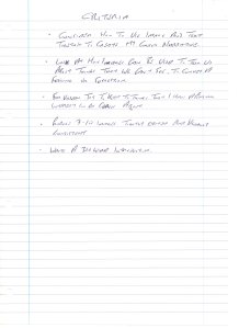
I first made a note of the assignment criteria to help guide my thoughts.

img502

I then considered technical methods for image making that might inspire some ideas.

img503

I then continued to put my thoughts on paper as to what I could conceder as unseen.

img504

I then made a list of potential subjects.

From these general lists I fell upon the subject of depression and hope in the context of redundancy.

I then decided to write a narrative which I gave a working-title of ‘Redundant Reflections’ .  Now I had my first draft of my narrative, I could then start thinking about what pictures I wanted / needed and how they might look like.  Therefore, I broke it down in to sections in my mind, then made a list of the images that I believed would complement the text.  I initially listed eight images then later decided that seven was enough.

I sketched out some ideas for images. a couple I used and for other images that I later produced simply came out my head as worked with my camera.

PUTTING IT ALL TOGETHER

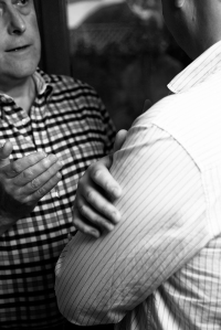
The first image that I made from my narrative represents the beginning of my recovery from my depression.  I wanted something to both represent my dog how she has contributed positively to my life. The lead refers both to a dog and walks / exercise, a toy representing fun and happiness / love and a dog biscuit that suggesting reward.

_DSC9096-resized

D-800e, 24-120mm f/4, @50mm, 1/80, f/4.5, ISO-320, ambient light, RAW.  Adjustments in Lightroom and converted to grey-scale in Photoshop.

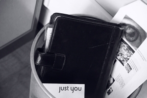
The second image I created is for the opening image to this project, representing my redundancy.  I thought of finding something that I used and is recognized as a familiar object that would be associated with work but now could also be considered redundant as a useful object.  A popular object from the recent past that is both no longer in fashion and redundant in popular use was my old Filo-Fax which has now been replaced by electronic diaries.  My first idea was to photograph it with other redundant objects such as a feather quill pen and bottled ink, old stamps and old redundant currency.  When I put it all together, I didn’t like it.  I then realized that I was looking for a strong metaphoric message for redundancy and that was simple.  Simply throw the Filo-Fax in the bin!   By chance the two pieces of paper that found themselves at the top of the bin couldn’t have been better placed.  An eye and a sales brochure with the words “Just You” as if to say, “We just got rid of you.”  In order to get a good exposure for the white paper and black Filo-Fax, I used my Sekonda hand-held lightmeter to take an incident reading.

_DSC9085-resized

D-800e, 24-120mm f/4, @120mm, 1/125, f/5.6, ISO-5000, ambient light, metered using hand-held incident lightmeter, RAW.  Adjustments made in Lightroom, converted to grey-scale in Photoshop.

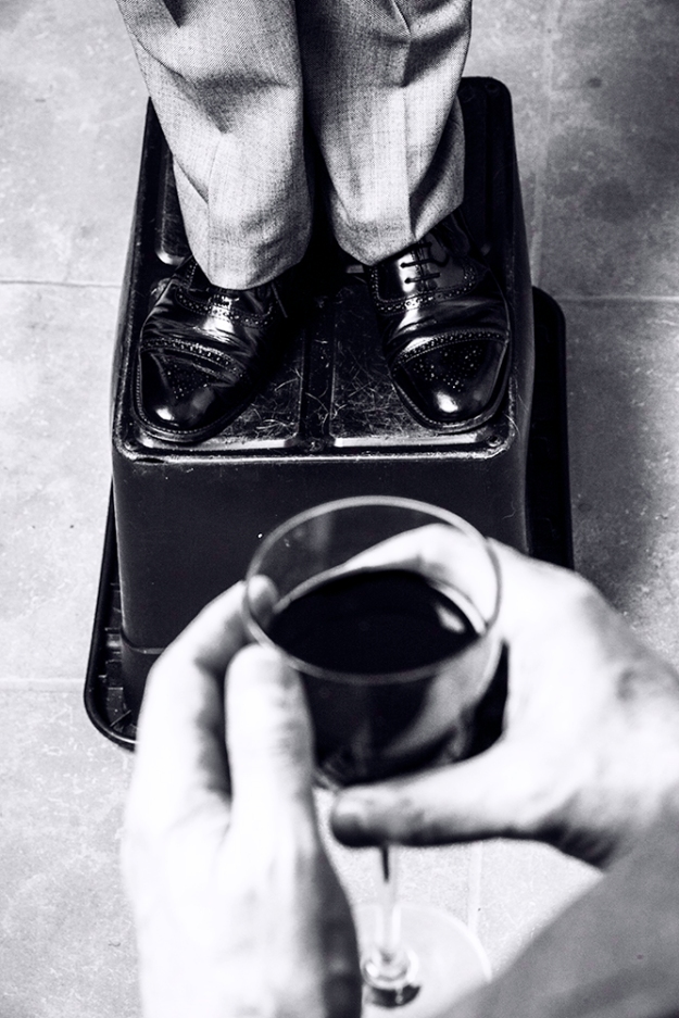
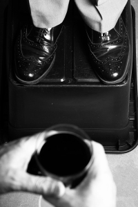
The next image I created was the second image for the first paragraph to represent my job hunting and the market conditions.  The idea for this image came strait off the page of my narrative.

_DSC9122-resized


D-800e, 24-120mm f/4, @31mm 1/80, f/8, ISO-4000, ambient light, metered using incident measurement from hand-held lightmeter.  Adjustments made in Lightroom, converted to grey-scale in Photoshop.

For the next image I worked on, my  initial idea was to play on the words ‘learning curve’ and using a stack of books to make a curve; but as you may see, I don’t think that this idea worked too well; so I stopped and read the book ‘This Means This, This Means That’ by Sean Hall, to get fresh inspiration.  The final composition was inspired by Alfred Hitchcock, he has used this point of view in a couple of his films.  The red No Entry symbol on the front cover of the book, I thought, would look better returned to red. by colour popping.

_DSC9169-resized

D-800e, 24-120mm f/4 @65mm, 1/160, f/4, ISO-4000, ambient lighting.  Adjusted in Lightroom and converted to greyscale in Photoshop.

_DSC9250-Edit-resized

D-800e, 24-120mm f/4 @58mm, 1/80, f/9, ISO-4000, ambient lighting.  Adjusted in Lightroom and converted to grey-scale and colour-popped in Photoshop.

Alfred Hitchcock.

However, when I asked my student forum to comment on my work, the consistent opinion was to keep all the pictures in grey-scale except for the last image which they agreed worked in colour; so I changed this back to full grey-scale and made alterations to the text as also suggested.

_DSC9250-a-resized

Camera settings unchanged from above.

I had an idea for the ending as something to suggest a new beginning and optimism for the future.  At the time of this project it was early spring with the buds just coming out and ideal for my last image.  I decided that although I have chosen to use grey-scale the last image must emphasise hope and I felt that a colour image dominated by green would suggest this.  Plus I feel that this change to colour also acts as a full-stop to the narrative.

Resized-9589

D800e, 105mm f/2.8, 1/80, f/8, ISO-125, ambient light only, adjustments made in Lightroom.

I then set about trying to create an image to suggest shock, I couldn’t find any examples on the internet other than foolish images of people looking wide eyed and open mouthed.  I considered a broken cup or spilt tea / coffee but I wasn’t sure that that would suggest anything other than a broken cup or a spillage.  I then had the idea of filling a cup with tea and photographing it as I banged it on a table to capture the shock wave like ripples. But as you can see, I don’t think that the image is powerful enough to convey what I was after.  In the end I decided that this image was not needed for the narrative anyway.

_DSC9495-Edit-resized

D800e, 105mm f/2.8, 1/250, f/3, ISO-800, remote shutter control with remote speedlight in a soft-box.  Adjustments made in Lightroom, converted to grey-scale in Photoshop.

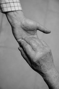
I decided to move on to produce an image conveying the business travel and my choice of image with the pillow can also be associated with the sack.  I am particularly pleased with this image, it’s simple but I think to the point.  (I hope you agree.)

_DSC9683-resized

D800e, 24-120mm f/4, @58mm, 1/60, f/4, ISO-800, ambient light only.  Adjustments made in Lightroom, converted to grey-scale in Photoshop.

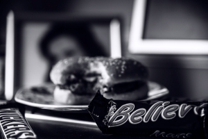
The last image I made for the set was to convey an impression of depression and poor health.  This came surprisingly easily, as I recalled that Hollywood movies often uses the symbolism of a tub of ice-cream when the heroin is depressed or sad; so why not use the same idea?  My first attempt was okay; but I didn’t think was strong enough in it’s message; so I reshot using a hamburger that really represented bad diet and unhealthy living.  This image I believe best represents the result of my redundancy which I think is far better than trying to create something to just symbolize shock.

_DSC9633-resized

D800e, 24-120mm f/4, @78mm, 1/125, f/8, ISO-125, remote speedlight in a soft-box.  Adjustments made in Lightroom, converted to grey-scale in Photoshop.

_DSC9744-resized

D800e, 24-120mm f/4 @86mm, 1/125, f/4, ISO-125, remote speedlight in a soft-box.  Adjustments made in Lightroom, converted to grey-scale in Photoshop.

Have I met the assignment criteria?

  • Consider how to use the image and text together to create my chosen narrative.

Yes, I believe I achieved this.

  • Look at how images can be used to tell us about things we can’t see, to convey a feeling or suggestion.

Yes, I believe that my images meet this aim.

  • Try to keep to things that I have a personal interest in or curious about.

Yes, I believe that I have kept within this field.

  • Produce 7 – 10 tightly edited and visually consistent.

Yes, x 7 key images consistent with the narrative.

  • Write a 300 word Introduction.

Yes, A 300 word complementing narrative.

Based upon the feedback from my fellow students from my forum, particularly the very helpful and I thought good advice from Steve Middlehurst, who suggested adding the stills as well as the slideshow for the assessors to be able to clearly scrutinize each image.  With this in mind I decided to put the slideshow at the very top just beneath the title and as each image represents the unseen I feel it works well and added the large stills beneath the text for closer examination.

I sent away for my images to be printed by a third-party printing company, when they came back I found that the crop they had used was not the same as I had expected and seen on my screen then ordering through their online website.  I had waited a week for the photos to arrive and decided that it was too risky to try and get a better print from this same company; so I visited my local Tesco that has a photo-lab but they could not offer a service that included a border forcing me to try and coble one up in Photoshop. Moreover, they could not offer a matching matt-paper, silk being their nearest option.  I emailed my Tutor who insisted that  my presentation should be consistent.  At first I was annoyed and turned to my student forum for advice.  They were all great, I got a little from some reminding me that I should be printing my own work anyway if I want to be a professional photographer which I needed to hear even if I didn’t at first like it.  A fellow student suggested a Canon printer that he uses and I ordered one on Amazon Canon PI7250 for £50, plus paper and spare inks.  Thursday, mid-morning I took delivery of my new printer and after unpacking and setting up spent the rest of the day figuring out the mysteries of printer profiles and colour profiles.  Fortunately, I have been in the practice of calibrating my screen using a Colour Spyder4 and by late Thursday evening I printing out my assignment photos for my Tutor.  I can truly say this assignment has taught me lots.


Working in Black & White

Working in Black and White

Working in Black & White, by David Prakel, Basics Photography, Published by AVA.

I have just read this book on black-and-white photography which covers both for film and digital with advice on developing and darkroom techniques for those unfamiliar with it and for digital post-production editing with Lightroom and Photoshop.  The book covers all aspects, including going about thinking about tones rather than colour; but explain a bit of colour theory to help with understanding the mental and physical grey-scale conversion.  If using film cameras there is also an explanation of filters for both cameras and darkroom enlargers, how and why they are used and how digital software that mimics filters that can be used and again why.  This book also looks at returning or adding colour to black and white prints either digitally or manually for various artistic effects.  This book offers allsorts of fresh ideas that can be brought to your work.

I began photography with a Pentax K1000 SLR working with Ilford Black and White film that I used to develop and print myself.  I would recommend any modern photographer who has only experience with digital cameras to have a go converting some images to black-and-white and playing with the effects.

The main reason I chose to read this book now is because I am going on a couple of courses at the Nikon school in London doing Film-Noir style black and white portrait photography.