Tag Archives: landscape

Formal Assessment for Assessment II, 9x items, labeled 1 – 8a and 8b

For this assessment, taking on board my Tutor’s comments I took two new photos one for image to simply change the composition from portrait to landscape for consistency and I changed the last image for a strong picture.  I also reprinted all the images using my Tutor’s suggestion of adding a little lilac to the Hue as I was unhappy with the colour cast I appeared to be getting as I couldn’t get a perfect black or grey.  This intended Hue is very subtle and I like the result.

Included in the folder is my Tutor’s report Shaun Mullins – 512659 – Photography 1 Context & Narrative – Assignment 2  a printed copy of the anchoring text for each image  marked 8a the-unseen and my 300 word introduction marked 8b redundant-reflections and the photos.


Alternative images as per my Tutor’s comments.

This slideshow requires JavaScript.

This is my new alternative presentation from my original work for assignment 2 based upon my Tutors comments.

My Tutor commented on two images that he felt should have been composed in landscape to be consistent with my other images and he felt that the last image was weak in comparison the the rest.  I have therefor re-shot to offer better alternatives.

The first was referring to my dog and this was the original portrait version.

_DSC9096-resized

Resized-New_DSC2141

D-800e, 24-120mm f/4 @ 120mm, 1/20 sec, f/8, ISO-320, daylight W.B.  Adjustments made in Lightroom to convert to black-and-white and then image tinted in Photoshop, Hue 257, Saturation 3.

This new version composed in landscape photographed in RAW and converted to black-and-white in Lightroom and tinted in Photoshop.

This next image Clive felt was weak.

Resized-9589

Clive’s two objections were that again it has in portrait and he felt the colour was at odds with the black-and-white theme of the other images.

I  can not re-do this picture to landscape as time has moved on and this bud has since flowered and gone.  Furthermore, I was never one-hundred percent happy with it anyway, as I had struggled to come up with a better idea for an image.  However, I have recently had a new idea that I like….

alternative-idea

As you can see I have sketched out my idea of an image of myself suited and booted shaking hands with another suited and booted person whilst discreetly crossing my fingers.  I want this image to denote a business meeting or interview and connoting a message of hope and optimism for the future.  I set the camera up on a tripod, used one speedlight in a soft-box controlled remotely by Pocket wizards.  The camera was set to manual and manual focus and tethered to my lap-top for picture control, I also used a separate Sekonic lightmeter to meter the flash.

_dsc2804-resized

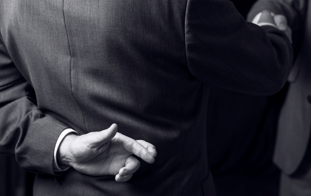
D-800e, 24-120mm f/4 @ 120mm, 1/125 sec, f/6.3, ISO-125, flash used, daylight WB.  Adjustments in Lightroom to black-and-white and colour tint adjustments made in Photoshop, Hue 257, Saturation 3.  On reflection of this picture, I now consider that a second light would have been in order, set in front of me and to the left to help separate my right arm from the background.  I could mess about in Photoshop to get better separation; but for this exercise I wont.

Using Clive’s suggested tinting I have produced new tinted versions of the rest of the black-and-white images.  The originals are on the left and the new tinted versions on the right.

_DSC9085-resized  Resized-New_DSC9085

_DSC9122-resized  Resized-New_DSC9122

_DSC9250-a-resized  Resized-New_DSC9250-a

_DSC9683-resized  Resized-New_DSC9683

_DSC9744-resized  Resized-New_DSC9744

Art Photography Now

Art Photography Now

I have just finished reading Art Photography Now by Susan Bright.  Book cover image by Viviane Sassen.  Published by Thames & Hudson.

This book illustrates and discusses the work of the currently generation of established Artists in photography.  Bright has divided her book in to different photographic genres: Portrait, Landscape, Narrative, Object, Fashion, Documentary, City.  With examples of work from Artists who are particularly known for a specific genre for example: Martin Parr – Documentary, Corrine Day – Fashion, Gillian Wearing – Portraiture.

An interesting read and a book to keep on the shelf for reference.  Some styles I had not seen before which I liked for example: Katy Grannan – Portrait; Rochard Misrach Andreas Gursky Dan Holdsworth and Doug Aitken – Landscape; Hannah Starkey, Bill Hensen and Jeff Wall – Narrative; Camille Vivier, Jonathan Villiers – Fashion; Erwin Wurm, Allan Sekula – Document; Naoya Hatakeyama, Richard Wentworth, Paul Graham, Philip-Lorca Dicorcia, Rut Blees Luxemburg.

I like Vivian Sassen’s portraiture style, I like her photo used for the book cover, this photo has the added punctum of the golden hand.

Camera Lucida by Roland Barthes

Camera_Lucida

Camera Lucida, by Roland Barthes, (2000) London, Vintage Classics, ISBN: 9-780099-225416.

Barthes examines, photography, what photography is, and how it works as a medium for art, commercial, social and private use.  This is an important book to read, unfortunately it can be a little hard to read, perhaps because of the translation and Barthes academic language; but worth persevering with.

  • Barthes classifies photos as either, ‘Empirical’, (Professional / Amateurs) ‘Rhetorical’ (Landscape / Objects / Portraits / Nudes) or ‘Aesthetic’, (Realism / Pictorialism).
  • A photograph is never anything but an antiphon (chant) of, “Look see,” “Here it is.”  It points a finger at the relationship it hold, it can not escape its denoted meaning. (page 5).
  • A photograph never distinguishes itself from its referent (what it represents).
  • A photo is a ‘signifier’
  • Barthes identifies two elements to a picture that is needed to make it interesting and he named them ‘Studium’ and ‘Punctum’.  Words he has taken from the Latin language.  ‘Studium’ is the general pleasing or good composition of the picture and Punctum is an element that punctuates through the image, an element that ‘pricks’ / creates an emotional response of some kind. (Page 25 – 28.)

The one thing that I got but didn’t fully realise until now is his idea of studium and punctum, a fellow student helped me with this when he posted a link to a good video explaining this theory.  https://phlearn.com/punctum-better-image


Reflection of my assessment feedback

_DSC9085-resized

1# I HAVE RECENTLY BEEN MADE REDUNDANT

I have just received my Formative feedback from my Tutor and am pleased to learn that he liked my work.

Shaun Mullins – 512659 – Photography 1 Context & Narrative – Assignment 2

This project like all the others I have had so far have been great learning-curves both in angle and in a sense of achievement.  All good.

Fortune was smiling on me when I set-up this shot as I simply filled the waste-paper bin of paper rubbish that I had rescued from our recycling bin and the sales brochure with JUST YOU happened to find it’s way to the top of the heap or I may have most likely not noticed it!

My Tutor comments on the text captions and choice of various font size.  When I came to printing I simply went by what I thought looked right.  This worked for this occasion; but I take my Tutors point and must not make this a habit.

My Tutor commented on the image with the Mars bar, that the word BELIEVE on the Mars wrapper was a little too obvious.  On reflection, I would probably agree.  However, this was not a trick of Photoshop the Mars packaging was genuinely labelled BELIEVE on all the bars that came out of a family-pack of six Mars bars purchased from a supermarket.

My Tutors comment regarding the last two images being portrait rather than landscape is also an interesting comment to remember.  I did not realize that the change in framing format would make a difference and therefore this is something I must try to keep in mind for future projects going forward.

The last image that I produced in colour, I had intentionally wanted the colour to be a dominant green to represent growth, hope and a new start (green for go).  However, again his comments are all useful and his suggested idea for an alternative image is good and simple.

I still have a lot to learn about printing; but my first attempt was acceptable at least and again I appreciate my Tutors advice.

One area of my study that I have neglected is visiting exhibitions and taking advantage of study days.  This I will start address from next week going-forward.

Also I appear to not be fully meeting my colleges strict copyright code, again this I need to address.

I am relieved that my assignment passed and that I can concentrate on my next assignment.


Photography The Key Concepts

Photography_The_Key_Concepts

Davis Bate, Photography, The Key Concepts, (2009) London, New Delhi, New York, Sydney, Bloomsbury, ISBN:978-1-84520-667-3.

Divided into eight chapters / subjects: History, Photographic Theory, Documentary and Storytelling, Looking at Portraits, In the Landscape, The Rhetoric of Still Life, Art Photography, Global Photography.

This is a very good book to refer back to as it contains lots of  brief explanations to subjects that keep cropping up through out my degree course such as photographic theory such as aesthetics, representation, structuralism, semiotics, etc.

Each chapter / subject can be read separately depending on which photographic genre you are working with such as portrait or landscape and some subjects will complement them all such as History and Theory.

Elina Brotherus


Photo by Elina Brotherus. This linked image is available to view on line at: http://www.paris-art.com

Elina Brotherus has used self-portraiture in some interesting and creative ways, I like this image of her reflection in the mirror held in front of the face of the model.  Brotherus has a good website illustrating a lot of her work.  Brotherus has also studied ideas of self-portraiture in connection with landscape and her environment and how they relate.