John Berger, About Looking (1980) London: Bloomsbury. ISBN: 978-0-7475-9957-9
Among my pile of books yet to read as part of my studies I had ‘About Looking’ by John Berger. I have only recently been introduced to this author through my Context and Narrative Course, I read his book ‘Ways of Seeing’ and watched the accompanying BBC TV program on YouTube which I found very interesting. I then went onto read ‘Understanding a Photograph’, in preparation for my fourth assignment. The recent sad news of John Berger’s death prompted me to read this book, ‘About Looking’.
This book is made up of a selection of essays, Berger wrote from the mid 1960’s up to the late 1970’s.
His first essay examines how man looks and sees himself; how he regards animals and his world around him and compares this to how other animals regards themselves, man and the world through their eyes.
His next essay looks at pictures by August Sander the famous farm hands going to a dance photo, Young Farmers (1914) and another image of a local musical band posing for their photograph and he discusses how their suits give away their status in society despite their smart attire.
Also included is an essay on the works of Paul Strand. The rest of the book moves away from photography and looks at works by other artists from the 17th century such as Hals through to Artist’s such as Francis Bacon and Giacometti of the 20th century.
An interesting read, Berger had his own style of writing and if you have heard him speak you can almost hear his voice coming through the pages of the book.
He was clearly very passionate about art and I am sure a nice guy to have met. I am sure all who were fortunate enough to have met him will miss him.
I went on holiday and had to wait until my return before I knew what he thought of my work and if I had to re-do any of it.
I was happy to learn that my assignment had been successful with only advisories that he suggested that I could do to improve the pictures.
I had complained that I could not obtain a true black-and-white with my Canon printer and that Canon was unable to help as they will always use the colours in the mix even for grey-scale only images; so Clive my Tutor has suggested that I deliberately add a colour cast similar in practice to Ansel Adams. Clive suggests using a slight blue purple hint to the images and advised that this could be achieved using the Black-and-White feature in the Layers and ticking tint and clicking on the tint box to bring up the colour menu. Type 257 as the value for Hue and 3% for saturation.
He also suggested some adjustments in Levels to improve the images.
Image 1# for example, Clive suggests that I darken the bottom left corner in order to prevent drawing the eye towards it.
This is my new version which I hope is closer to Clive’s idea.
This again needed more work, Clive notice a dark line at the top right of the image that I had missed and I wasn’t happy with the cross that I wanted in the image, it was too faint.
This is with the new adjustments made in Photoshop using the cloning tool and the dodge-and-burn tool.
This next image Clive suggested the shadow behind Sarah should be softened for better separation.
He is right of course and I think that this is a better version.
Image 4# was a little too dark.
This is the new adjustment.
This was not my favourite image and I have struggled to improve it as Clive suggests. I need more Photoshop experience.
Image 5# Clive complains that the composition is too tight with the edge of the box too close to the edge.
Unfortunately I do not have anther photo that offers more space and this would require reshooting; so all I can do is add the tint.
Image 6# Clive complained was too dark.
I hope that this is an improvement.
Adjustments made in Photoshop, Layers, Levels.
Image 7# This image Clive felt was okay.
I have just altered the tint.
Image 8# Clive suggested that the background was similar in tone to the hands.
This is my new version.
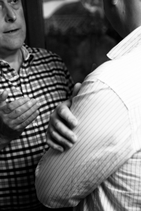
The last image that Clive critiqued was both for composition and exposure. My hand should be more central and the focus of the picture and my shoulder is too bright, so drawing the eye away from the subject.
My solution was to choose another image and make some adjustments in curves in Lightroom before finishing in Photoshop.
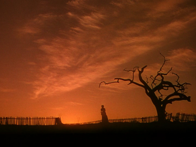
This image is fabricated, created from scratch in a Hollywood film studio. The sky is hand painted using a technique called movie-matte-painting. The tree and fence are just props.
The first impression I have, looking at this picture, is a sense of foreboding and a feeling of uneasiness.
What we see: a sunset, a triangular shaped cirrus cloud, a very low horizon, a picket fence and a small female figure. We appear to be looking at her from in front and to her right, so as to see the silhouette of her chest. Her left arm is just out of view, but her posture suggests that it must be mimicking the right. To the far right of the picture stands a tree. Its branches are naked. One branch leans over towards the female figure and ends in a shape reminiscent of a hand-held scythe, with the tip of its blade pointing down on the figure below.
My interpretation
This is the final image from the last scene in Act 1 of the motion-picture ‘Gone with the Wind’. The audience has just witnessed this lady turn from desperation to determination; and the final image is made to look satanical with its fiery sky a witch like figure and a scary looking tree. We are encouraged to draw parallels from our imagination. I see Dante’s imaginable idea of ‘The Inferno’ and to quote from Canto III, lines 1 -3, ‘Through me you pass into the city of woe: Through me you pass into eternal pain: Through me among the people lost for aye.’ I am also reminded of the lines from psalm 23:4, ‘Even though I walk through the valley of the shadow of death, I fear no evil; for thou art with me…..’
I see a lot of symbolism in this image:
From the point-of-view of the movie, The American Civil War was still within living memory of an elderly American generation; and perhaps because it was made with access to living witnesses some of the scenes are so remarkable (the siege of Atlanta for example). Therefore, the movie makers intended that this image translates that fences still need mending between the North and South.
However, I see the picket fence on several levels:
1, As representing home, family and her life; it is rickety and in need of repair.
2, Seen with a stripped tree, the broken picket fence also appears to suggest destruction and hardship.
3, The fences denote a road; and the setting sun behind her, with the fence leading to the foreground, connotes a journey.
The horizon has been set very low to give emphasis to the sky above Scarlet’s head, she stands as a small figure, as if under heaven or a damned soul at the bottom of the pit. The sky is like her name Scarlet; and it is also acts as a signifier for many ideas: the unholy oath she just made in this scene, loss of innocence, war, and a sun setting over a disappearing civilization and way of life.
I see 1939 in this picture, war had been declared in Europe. For many people watching this film, their own civilization was in danger of going the way of the South and the sun was setting over their world and their way of life.
The space for the sky on the left is filled with a triangular cirrus cloud with a faint suggestion of a crucifix in its pattern, strengthening this idea of heaven and earth. This iconic symbol can be identified for denoting, love and peace; but it also connotes hope, forgiveness and unity under one faith.
The lone female stands like the tree leaning back angled in symmetry with its trunk. Her arms hang down by her sides and her visible hand appears clenched. Her posture suggests that she is standing to attention, just as a tired and battle weary soldier might stand. For the American audience of 1939, the woman could be regarded on different levels, depending on who you were:
1 For middle-class white Southern and Northern citizens she is the fair and defiant but beaten and battered South.
2, She could also be symbolic for many working class Americans who suffered during the 1930s economic recession; and could be regarded as a figure denoting a nation that is getting back on to her feet and standing defiantly against her adversaries; thus connoting National strength and endurance.
3, In 1939 many people were still denied equal rights. For the audience, this figure in silhouette could therefore be black, white, yellow or any cast the viewer chooses. She is a woman, considered the weaker sex, but seen here to be strong and encouraging hope. “I know I have the body butt of a weake and feble woman, butt I have the harte and stomack of a king, and of a king of England too”Elizabeth I, 1588, Tilbury.
The tree is stripped and broken, yet it still stands, heroically defying the ill winds that have stripped it. In his book, ‘Camera Lucida’, Roland Barthes described a feature in a picture that is a focal-point that he calls a ‘Punctum’ something that makes a nice picture an interesting picture. I see the tree as the Punctum in this picture. The silhouetted woman against the sunset and cloud makes a nice picture which Barthes calls the ‘Studium’ but the sinister tree with the branch hanging over her head turns this in to a more engaging photo (in my opinion). The branch immediately above Scarlet’s head looks like a bony finger; it appears to point down on Scarlet like a condemning finger that is passing judgment. In the context of the movie the tree could also represent the Union with its terrible judicial judgement on the South.
So why the title?
As the Technicolormovie camera began to photograph this scene a technician would have held a card with different colours printed on it in front of the camera to assist for colour calibration later on in development. The Technicolor team referred to it as a ‘Lilly‘ card if the filming was successful at the end of the scene the technician would call “It’s a Lilly!”
psalm 23:4 – Translation from the original tongues being the version set forth A.D. 1611 Revised A.D. 1881 – 1885 and A.D. 1901 compared with the most ancient authorities and revised A.D. 1952 (The Bible Revised Standard Version Published by WM Collins Sons & CO Ltd. For The British & Foreign Bible Society)
I have just completed a one day mosaic course with an artist called Jane Visick based in Hitchin in Hertfordshire.
It was a great experience and something I believe that I can incorporate with my photography. Jane works with all kinds of materials, glass, ceramic, stone, metal, gems, plastics, resins practically anything you can cut up and glue down. She mosaics floors pots, walls anything and anywhere. I want to use my photography to inspire ideas for images to mosaic.
The course consists of a practical workshop in which the student will have made a small mosaic to take home the course is for 1-3 and I was in fact her only student for my day with her. During my initial conversation I suggested that I send her some ideas for my mosaic and for her to advise which if any was suitable to be completed in a day. I looked through my photo library and offered up these images.
Jane suggested that all the fish and the flowers were possible and I decided upon a fish image and this was the chosen image to use for my mosaic.
This was a blown up section of a larger picture. All the fish pictures were taken using my Nikon D-800e 24-120 f/4 with an attached polarizing filter and the aid of a speedlite. I chose this image for its movement colour and shape made by the water.
On arriving Jane briefed me on the tools and materials she used and books to read an in fact by coincidence her best book to recommend that I obtain, I had already placed on order through Amazon.
We began by deciding on the materials to use and glass was the decision and she then showed me the Technics of cutting glass to shape. We then took my printed photo and laid it with a layer of carbon-paper on to the chip-board base to wish I was going to mosaic and using a pencil I drew around my fish and areas of different colours pressing so that the carbon paper below marked the chip-board with my desired design. Removing the photo and paper I now had my design to mosaic. We then selected the coloured glass and I began cutting up the glass until I had about a dozen small pieces to start choosing and gluing.
I was surprised to get the mosaic finished by the end of the day with only the grouting left to do and Jane provided me with a bag of grout to take home and this is the final result of my labors.
For a first effort I am very pleased and encouraged. The mosaic was photographed on the floor inside a homemade light-tent of tracing-paper rolled in to a cone shape with the camera mounted on a tripod above and illuminated by three speedlights operated by infrared controller mounted to the camera. the green glass is a stain-glass and is a mix of green and a white opaque which was perfect to represent the water of a pond. I chose to use a light-tent to create an even lighting without any annoying reflections. I am pleased with the result as it is a good reproduction of the actual mosaic.
On considering if I have access to archive material that I could perhaps use for a later project? the answer is yes. I have my wife’s Aunt’s old photos, plus photos that my wife’s Uncle and Aunt took of themselves and my wife’s immediate family. Plus photos from my own family. I am sure I could obtain access to photos kept at local museums such as Chertsey, Weybridge, Brooklands, Hampton Court, etc.
I had an idea that I once thought of as a good idea for a novel. A few years ago Brooklands recovered a crashed Hawker Hurricane that was built at the Brooklands factory and first flown by the American Eagle squadron during the Battle-of-Britain, 1940. It was later shipped via the highly dangerous Russian convoys to Russia under lend-lease and flown against the Germans on the Eastern-front before being shot-down and crash landing. The Russian pilot survived and the plane was abandoned and forgotten until re-discovered and returned to Brooklands. Perhaps a narrative can be created in a series of photos of the people that this aircraft touched from family pictures of aircraft riggers and fitters, aircrew, sailors, allies to the enemy.
Nicky Bird purchased old unwanted photographs on Ebay, first waiting to see if anyone bid for them and if no-one did he purchased them himself and asked the seller, how they came to own the pictures and what they knew about them?
This is an interesting subject as I had never imagined that family photographs would ever become unwanted / redundant. Their meaning lost, their memories forgotten. That is until a recent event in my own life touched on this very subject. My wife’s Aunt died without issue in 2011, her husband had died the year before and she left her whole estate to her four nieces. When we were going through her things (which was a big task as she left a six bedroom house to be liquidated) I came across two old leather suitcases full of old family photos mainly of my wife’s Aunts family taken in the 30’s and 40’s. No one was interested as Sarah’s Uncle was the family link and if I hadn’t have taken these cases myself they would have been lost for ever. At the time I took them I had no thoughts of photography; but I felt a certain sense of responsibility that these lives should be remembered and these images should be kept. I can’t explain why, I just thought it was the right thing to do. Perhaps it is simply was that we all feel important and deep down wish to be remembered. Photography gives us this chance, even if the name and the memory is lost the image can still tell future generations that we existed, what we looked like, how we dressed, and how we posed, even what the world around us looked like. Photos are more important in this respect than say a painted portraits of a Victorian, for example. The photograph gives a better likeness, it captures the confidence or awkwardness of the subject; thus hinting at his or her character. The camera captures background that can tell a little about that moment in time and perhaps history that the artist may leave out or re-interpret. Sadly many family pictures will disappear over time and the surviving images will become more and more important. Imagine if photography had been around at the time of the first Roman Republic, even if only all that survived was a few family photos of only ordinary citizens our historians would have a field day!
In this exercise I am asked if Bird’s second-hand pictures displayed on a gallery wall elevate their status?
I guess the answer has to be yes, for now they are now the focus of attention and anyone or anything that becomes the focus of attention must by default become elevated in status.
Where does their meaning derive from?
Their meaning derives only from the context of their use if they have lost their original identity. An unwanted family photo of an unknown person, taken under unknown circumstances, perhaps even the location is unknown, then only the meaning that is attached to the picture from the exhibition exists.
When they are re-sold is their increased value because they are now art?
This is a commercial question and one that can not be simply answered with a yes or no. If the exhibition is successful, if the pictures can attract a contemporary historians eye, if the pictures can capture the imagination of art collectors, there is a lot of ifs, if the seller can market these images correctly / cleverly to the right market. Art is very subjective.
This is an interesting piece of work that is mentioned in my coarse material, Adam Broomberg and Oliver Chanarin worked together on a project using found images archived in Belfast, Northern Ireland, documenting the troubles and lives of ordinary people taken by photojournalist and the public. When Broomber and Chanarin examined this archive they found a number of photos with coloured Dot type stickers attached over some of the images, these had been marked for their suitability for publication. The stickers had been randomly applied but inevitably covered an area of the picture. Broomberg and Chanarin uncovered these areas and reproduced pictures of only the round area that had been hidden by the coloured Dot. By displaying these images without the rest of the picture the meaning of the image changes and a new narrative is created.
Fascinating documentary following the work of Gregory Crewdsen as he prepares and takes the photos of his cinematic scale images using cinematic-lights a film-crew of up to 60, professional actors, cranes, assistance from police and fire departments, closure of streets exactly as a scene from a movie would be organized, staged and shot only instead of a cinematic movie camera Crewdson uses a large-format still camera. He will then take the best examples and merge them together in Photoshop collage them in to one final perfect image.
Do I think there is more to this work than aesthetic beauty?
yes, I find his images both beautiful and disturbing, as I believe, is his intention in order to create an interesting and engaging narrative.
Do I think Crewdson succeeds in making his work ‘psychological’? What does this mean?
Yes, I do. His pictures are almost dream like, the scenes are very surreal. They encourage the audience to wonder what is happening? what has just happened? what is about to happen? They are like that moment in a dream that is taking that turn in to the nightmare. This touches on our own imagination, our own fears, our own anxieties.
What is your main goal when making pictures? Do you think there’s anything wrong with making beauty your main goal? Why or why not?
My main goal is to make interesting pictures, if the subject matter is beauty then that is what I want to create, if the subject matter is not then I want to make the image suitable for the subject with a choice of composition that holds the audience at least for a little while. I do not think that there is anything wrong in making beautiful pictures; but it can become a little dull and boring if we can not vary the subject matter and produce images that offer some kind of narrative or symbiotic meaning that can engage, challenge and even entertain the audience in some way.
I like Crewdson’s pictures they may not be as subtle as Wall or DiCorcia but they are very well made and they can appeal to a public that doesn’t have to first have an acquired taste or understanding of art to appreciate the picture that they are viewing.
For this assignment, I am tasked to create a photo or photos that are of a self-portraiture nature. The brief is fairly loose; but I have had an idea that I first checked with my Tutor to be sure that it would be acceptable.
My idea is to explore the question of my identity, how is my identity seen from other peoples perspective?
I have asked a couple of close friends and family to write a frank and honest assessment of my character and from these assessments I will extract ideas for creating images that represent Shaun Mullins as regarded by others.
My first assessment is from my father, Barrie Mullins.
Having been given my character assessment from my father, I started to jot down some thoughts and ideas. Having read it through several times I divided the text into subject matter to develop.
With these thoughts I narrowed it down to three subjects to use from my father’s assessment and began to think about what each can represent.
And looked again at the text and how my chosen subjects are used in context to my fathers narrative.
‘High ability’ (“when he wishes to exercise it.”)
‘He appears to denigrate any achievements’
‘A man that one would trust’
I now began to sketch and jot down ideas.
I made the decision to work in black-and-white for this assignment and as these are ‘self-portraits, I felt that it was more appropriate and perhaps stronger for the composition if the are all framed in a portrait format.
My first attempt was for ‘High ability’ with an idea that immediately came to me and I quickly made it without bothering to sketch it first.
However, I felt that it didn’t link to my father’s text, nor was it strong enough symbolically. I also decided that I want to make self-portrait styled pictures that only imply my presence with at most say only a hand, a shadow or just a part of my body, etc.
This was my next attempt; but I still felt that it didn’t convey the message of ‘High ability’. Moreover, perhaps even my father’s face was not necessary either. I moved on to another shot I had properly planned with a sketch.
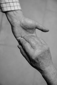
This shot is for the last image, ‘A man that one would trust’. My father is 87 and I thought about how this suggestion of trust could be manifested in an image linking my father and it occurred to me that giving my father a helping hand might work and this is the image I had in mind and I think it works.
My next image that I took was another attempt at ‘High ability’
However, I felt that this image still wasn’t strong enough and my wife didn’t like it either although she felt that the image of Sir Edmond Hillary conquering Everest was a strong symbol; so I had to organize a re-shoot with my father. Unfortunately, despite his keenness to help, his patience is very short and due to his age he tires very easily and quickly; so he was quit challenging to work with, particularly when some of the shots I needed were challenging to make particularly as I had restricted myself to a portrait format.
During this same shoot, I also attempted to get an image for ‘He appears to denigrate any achievements’. But again I felt that this just didn’t work.
On our next session together I had re-planned and the results for the two needed images I believe are now much stronger and meet the requirements that I was looking for.
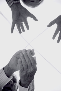
This image is to represent ‘He appears to denigrate any achievements’ and I felt I needed to contrast praise with denial / refusal and I had the idea of simply my father clapping and with myself holding out my hands asking him to stop. I really only wanted the hands to symbolism the sentiment, this proved more tricky that first thought and when I tried to sketch my mental idea I struggled. I turned to my camera and fitting it to my tripod and tethering to a computer to see what the camera was seeing I tried different ways of composing the image. In the end I decided to lay the camera of the ground looking up whilst still tethered to my lap-top in order to see and compose and take the picture. With my father this still took over an hour to do and in the end I had to merge two photos together in Photoshop to get the desired combined poses in one image. My kitchen skylight worked to provide a nice blank background with a faint cross which is the frame of the pyramid skylight that also is a nice subtle addition to the image. Also, my fathers hands in the act of applauding with my own hands out stretched to ask him to stop appears to mimic the faint cross in the skylight.
By the time I had made some useful images for ‘He appears to denigrate any achievements’ my father was very tired; but my last image was fairly straightforward and easy to make as I could hold the camera in my hand and take the shot over my father’s shoulder for this image of my father holding a photo of Sir Edmond Hillary with my British and American Private Pilot’s Licences that he refers to in his assessment.
I now believe that I have three images that now work and link effectively to my fathers text creating a visual narrative. One or two of my images may be considered strong enough to stand alone; but they all clearly gain strength as a visual narrative when seen together and are linked to the text.
Barrie Mullins, “He is a man of high ability when he wishes to exercise it.”
Barrie Mullins, “Despite success in life and work…….he appears to denigrate any achievements.”
Barrie Mullins,”A man that one would rely on and trust protecting one’s back in this dangerous world.”
I have decided to only use the second and third images in my final presentation.
Yesterday, whilst out taking a walk with my wife, we paid a visit to an art exhibition being held by one of our neighbors who is currently taking part in a County wide art festival of open studios (Surrey Open Studios).
The artist’s studio that we visited belonged to Emilyn Hill. By coincidence, I knew this lady through my dog walking; but hadn’t known until now that she was an artist. Her work is very good and very interesting. Influenced by surrealism and cubism she has done a lot of work turning famous painting in to three-dimensional sculpture then re-arranging it and re-painting it. Her work is very varied as can see from free her brochure and postcard. Sadly she is now in late stages of MS which is restricting her physical abilities; but she is still working, producing smaller pictures and painting on to furniture.
my wife and I both agreed that Emilyn Hill’s work was truly inspiring.


 my wife and I both agreed that Emilyn Hill’s work was truly inspiring.
